Merger branding creates fundraising powerhouse
Merger branding creates fundraising powerhouse
CLIENT
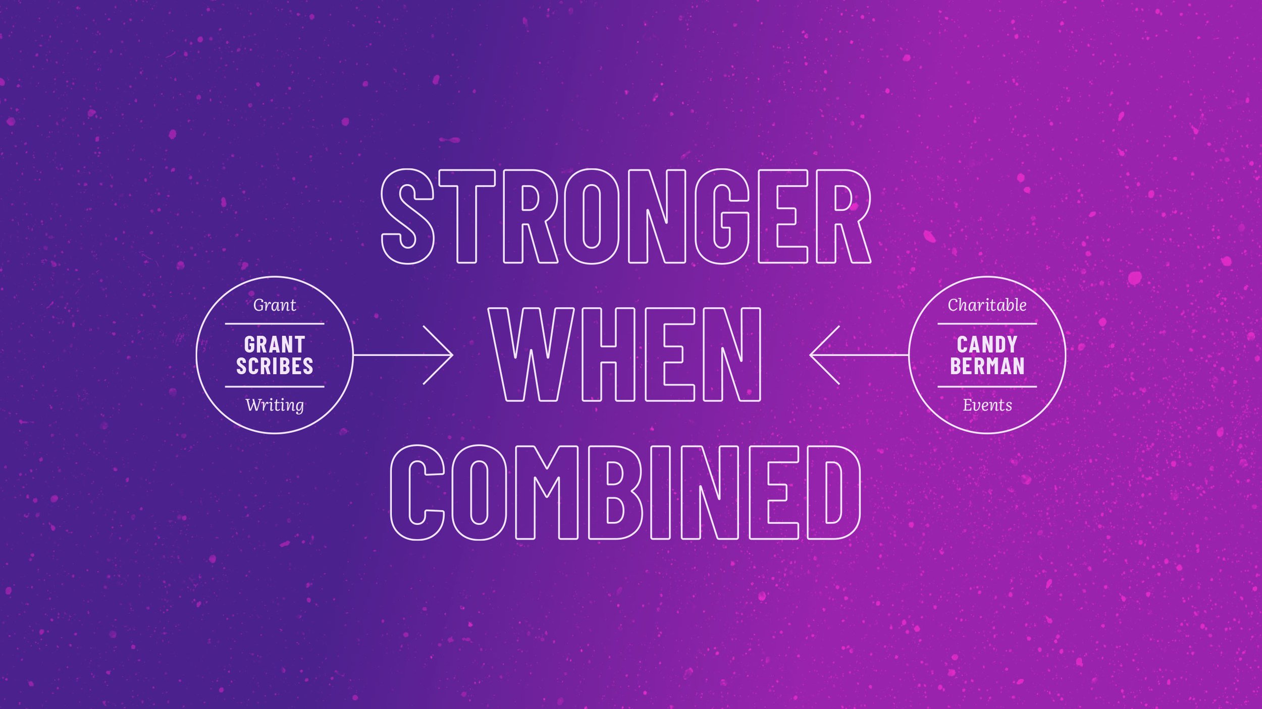
Grant Scribes (grant writing)
Candy Berman (fundraising events)
SCOPE
Strategy definition
Name development
Visual identity design
Brand touchpoint design
Mergers beg a question: who are we now? Without a clear answer, brands become diluted and weak.
The team that became Alloy Fundraising answered that question with conviction: we’re advocates, and we’re developing equitable, thriving communities.
The resulting brand is strong A.F.
Before

After
Before

After
Project overview
01 Strategy definition
The inner identity
Through a discovery process, the client identified the archetype of the new brand: the Advocate. This inner brand identity was just as important as any outer identity, as it clarified the unique role the brand would play in the world.


Purpose & personality
The team already knew what they offered, but putting a fine point on why in the form of a purpose statement further united them and fueled their efforts.
Referent collaborated to identify three personality traits that express how the brand should look, sound, and behave. These traits became the bridge from strategy to creativity.



02 Name development
With a bold personality and a purpose more aligned with peaceful protests than corporate practice, the new brand needed a name to match. After extensive exploration, Alloy rose to the top. A close homophone for “ally,” Alloy also tells the story of strength and partnership, while paying homage to the brand’s history.
03 Visual identity
Logo & mark
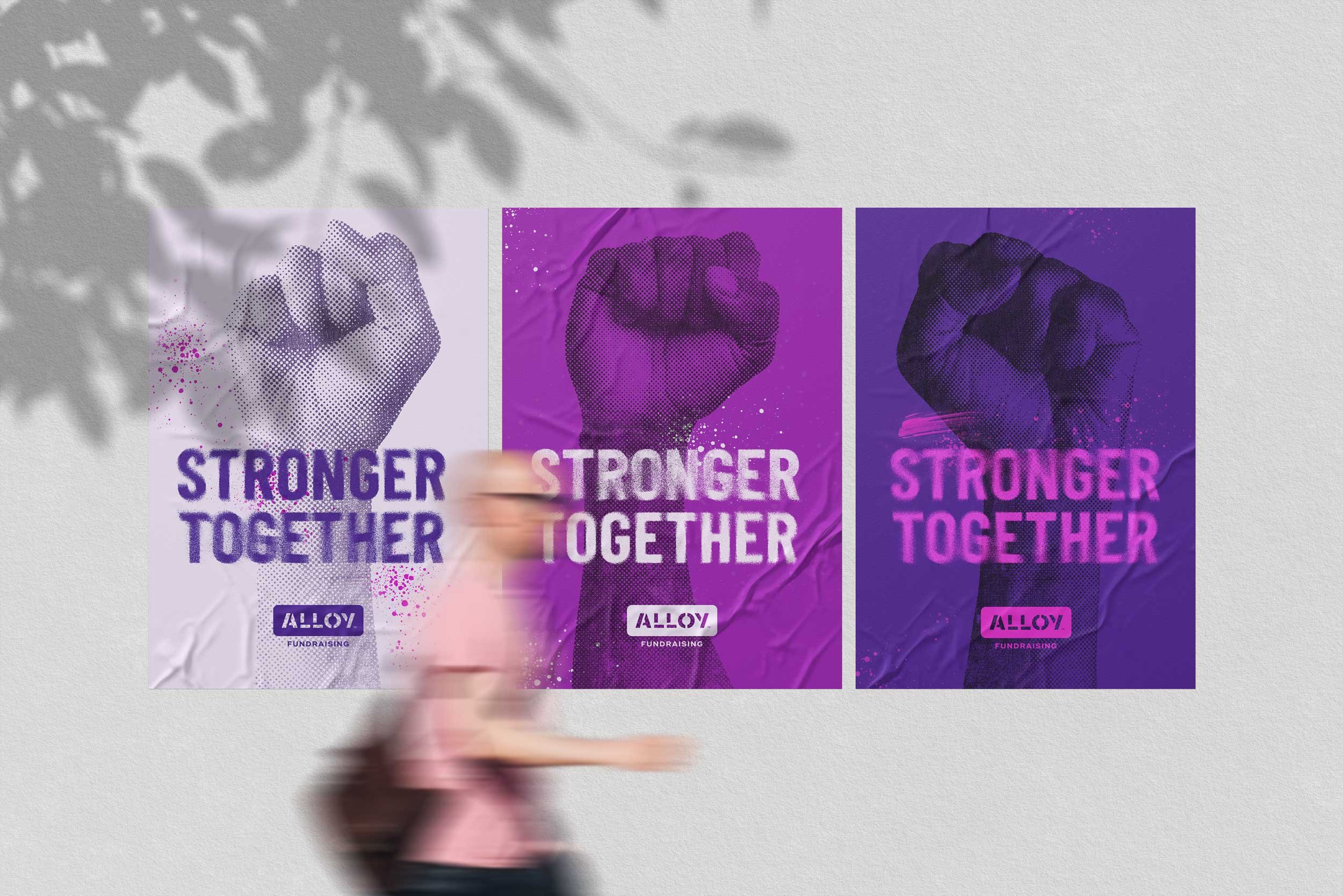
Alloy’s primary logo is inspired by stenciled lettering used by grassroots change makers and street artists. This edge is softened with a deep purple-violet gradient that transforms rugged typography into something positively energized.
Color palette
Playing against competitor’s corporate brands, the Alloy palette reflects the female leadership, vibrant energy, and playfulness of an authentic team. The headline typography, also inspired by protest signs, is paired with a more reserved body typeface, reflecting a mix of idealism and professionalism.
03 Touchpoint creation
Referent led the creation of a new website which puts nonprofit clients front and center through a landing page video and client-provided imagery throughout the site.
The decision to showcase nonprofits aligns perfectly with the brand’s purpose.

“We came to Referent with what we thought was a complicated merger of businesses and they expertly guided us through targeted exercises that got us to an authentic brand identity that we not only agree on but absolutely love.”
Shoshana Ben-Yoar
President & Managing Partner
Alloy Fundraising
“Referent’s ability to quickly understand our work and the sector's landscape was impressive. The design felt accessible and relatable to our current business and simultaneously edgy and fresh to lead us into the next evolution of our company.”
Lauren McCarthy
Partner & COO
Alloy Fundraising


