Customer insights guide evolution of outsourcing brand
Customer insights guide evolution of outsourcing brand
BRAND
Go HQ (formerly DMGgo)
SCOPE
Strategy definition
Name development
Visual identity design
Verbal identity system
Brand touchpoint design
DMGgo started as a back-office outsourcing partner for transportation businesses. As it grew, expanded services, and acquired a related business, strategic questions emerged:
Should DMGgo split into distinct brands for each service area?
Should it continue expanding under a single brand?
How could the brand evolve to support long-term growth?
What elements of the existing brand should carry forward?
To answer these questions, DMGgo partnered with Referent to reimagine its brand. The result is Go HQ—a brand built to support the next stage of growth.

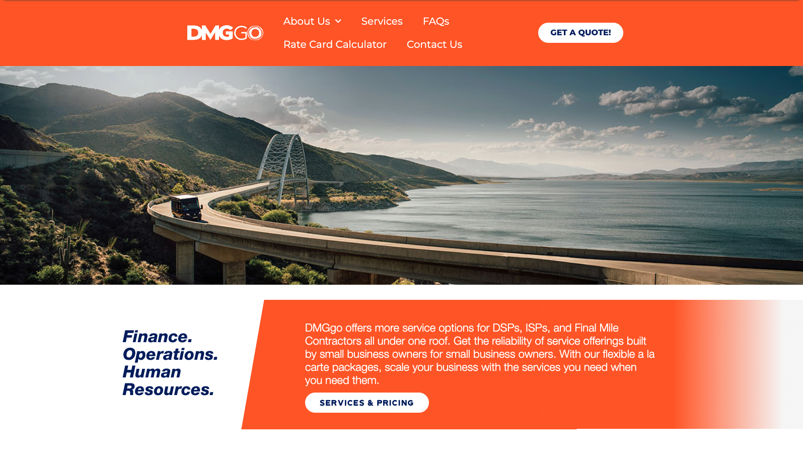
Before


Before
Project overview
01 Brand value assessment
Strengths & opportunities
Using our Brand Value Framework, Referent evaluated the existing brand across five key categories. The assessment revealed clear strengths and opportunities, providing a strategic foundation for growing brand value while reducing risks associated with change.

Outcome
With the brand’s strengths and opportunities clearly defined, Referent delivered strategic recommendations to optimize brand value, including:
Evolving the name beyond “DMG” while preserving equity in “go”
Maintaining a single master brand while introducing distinct service lines to clarify the offering and reinforce value
Centering the brand experience on customer pain points, with an emphasis on time savings
Amplifying existing brand equity in the color orange
02 Strategy definition
Removing limitations
Drawing on internal and external insights, Referent crafted a purpose statement to guide the new brand—one centered on empowering entrepreneurs by removing barriers to their success.


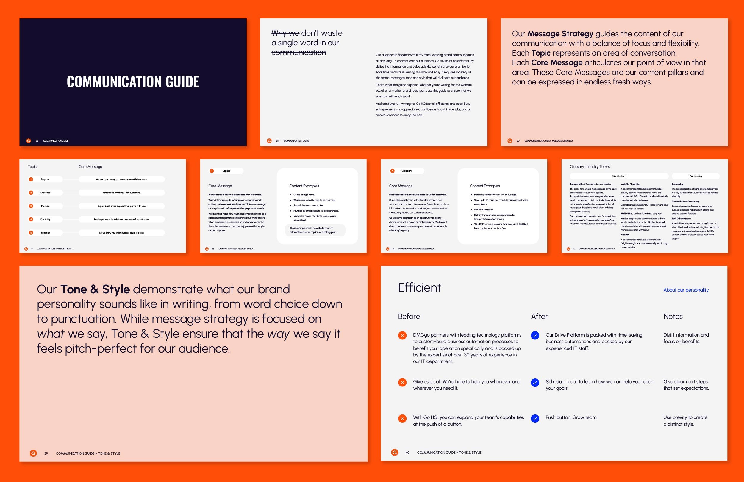
03 Verbal identity
Name evolution & communication guide
The name “DMGgo” needed to evolve into something more streamlined and meaningful while preserving a connection to the original. Since customers strongly connected with “go,” we made it the foundation of the new name.
Referent also created a brand communication guide, including content strategy and voice. The result: a more recognizable tone that resonates with customers.


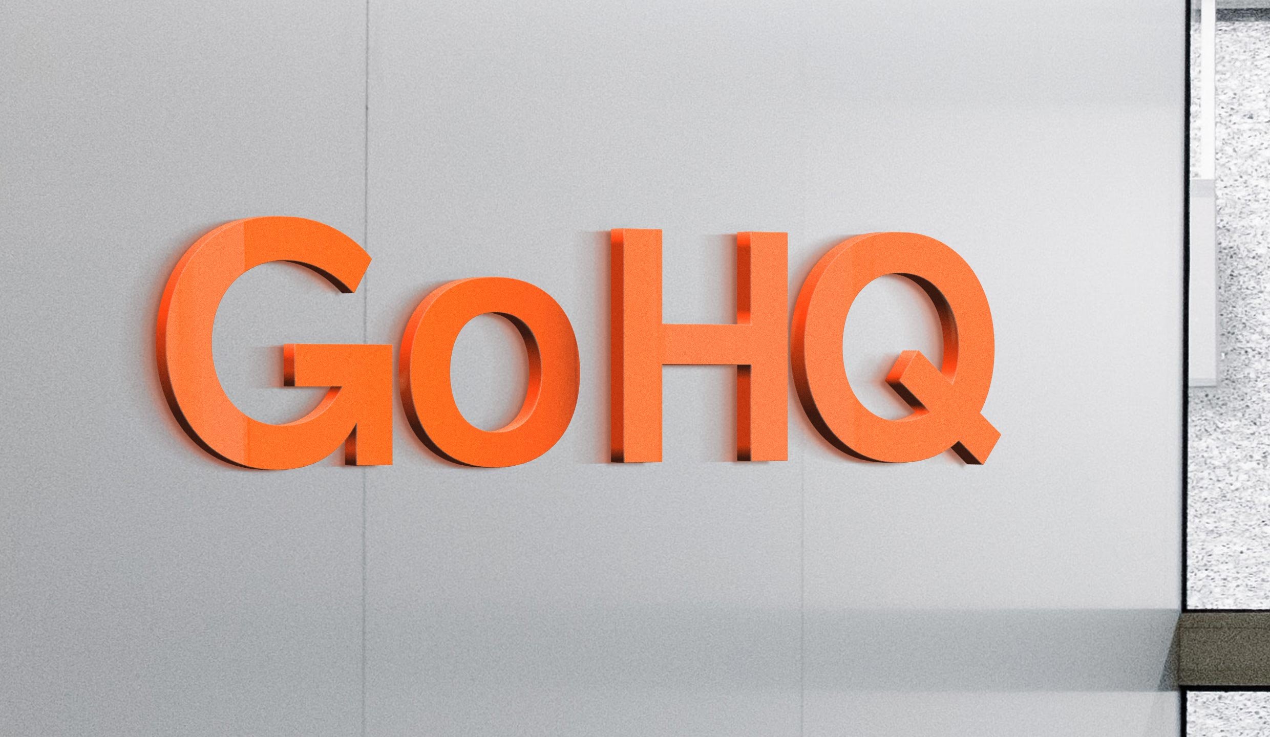
04 Visual identity

Logo & mark
The Go HQ logotype was designed to convey speed and clarity—core themes of the evolved brand. The “G” in “Go” incorporates an arrow shape, brought to life through animation. The “G” mark is simple yet distinctive for strong cross-platform recognition.

Evolved colors & typography
Surveys showed DMGgo’s orange and blue were highly recognizable. Referent built on this equity, amplifying the orange and refining the rest of the palette for clarity and a friendlier, modernized feel.


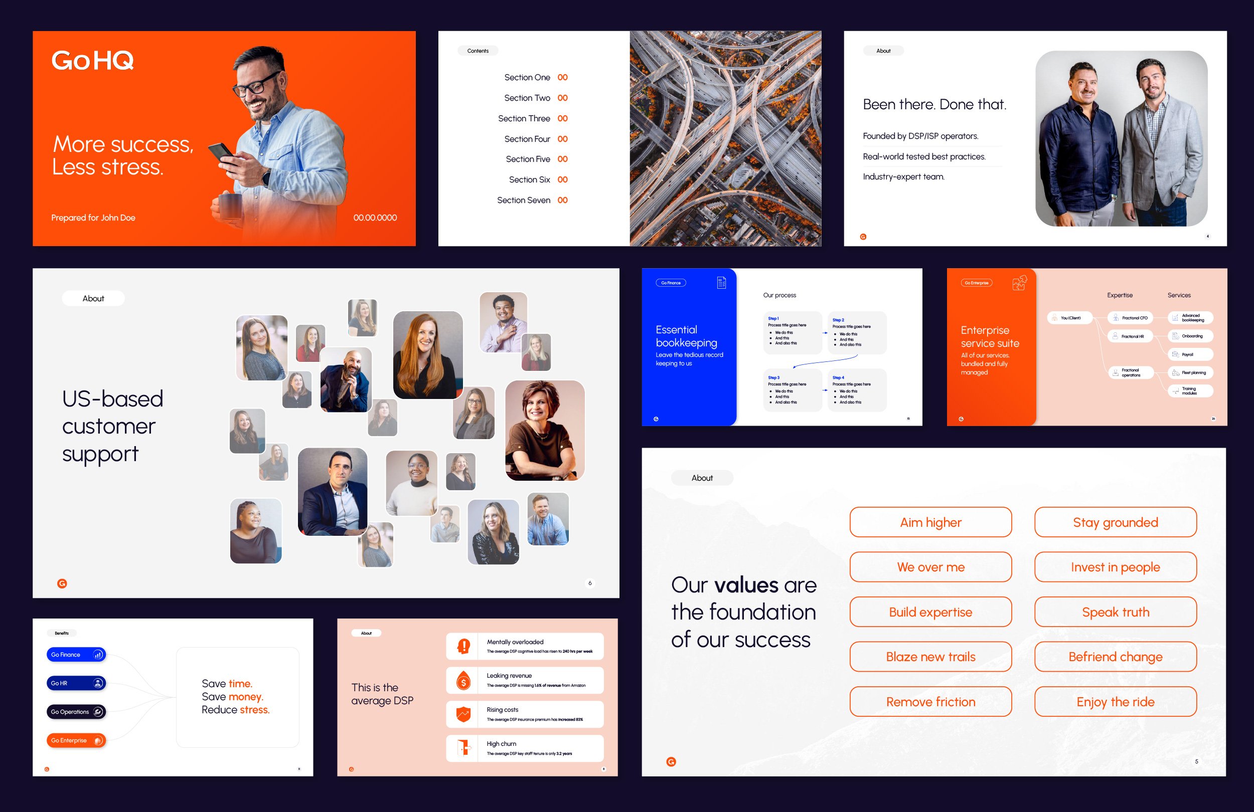
Service line branding
To help customers navigate Go HQ’s broad offerings, Referent developed distinct service line brands. Each line reflects a service area typically handled by a standalone provider—making Go HQ’s total value for customers significantly easier to understand and appreciate.


05 Touchpoint creation
Referent led the creation of a new website that unifies the brand’s visual identity, voice, and service line structure. The result is a reimagined digital experience that solidifies Go HQ’s position as the innovation leader in their category.

Before
Before


After

“We came to Referent with what we thought was a complicated merger of businesses and they expertly guided us through targeted exercises that got us to an authentic brand identity that we not only agree on but absolutely love.”
Adam Angell
Co-Founder & President
Go HQ
